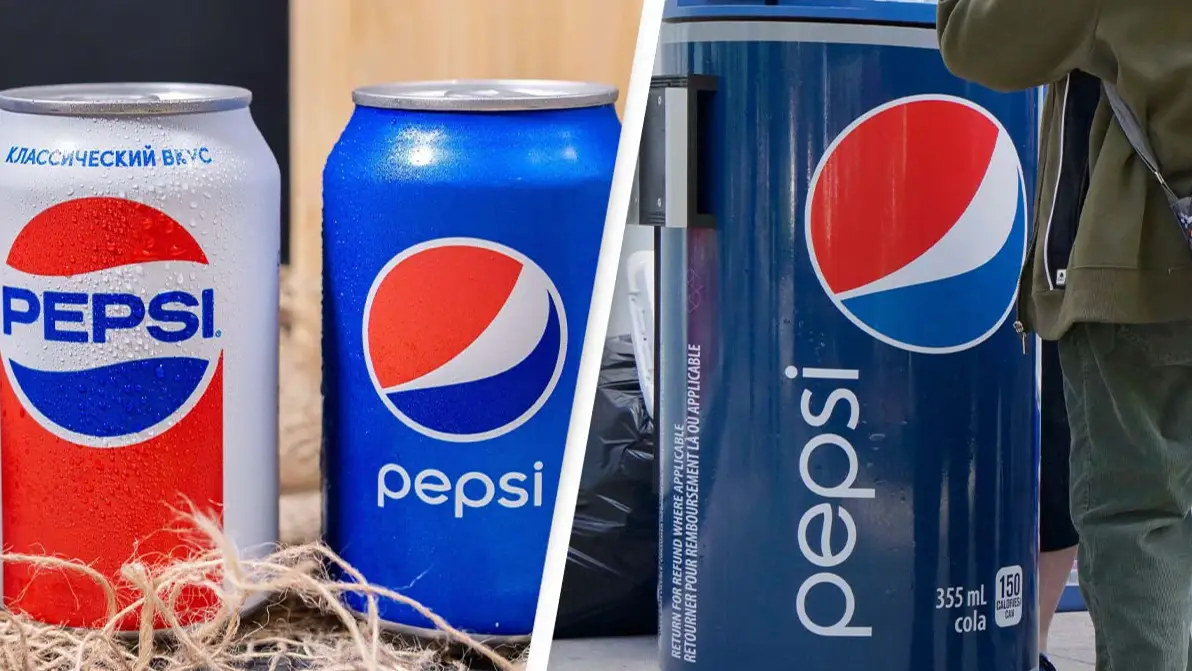
Pepsi's 2009 logo rebrand cost them $1 million due to unusual hidden features
Topics: News, Food and Drink, Social Media, Viral
Topics: News, Food and Drink, Social Media, Viral
Pepsi paid an astronomical amount for their new logo but it does contain links to the Mona Lisa and the Theory of Relativity.
While paying out a cool mill for your soft drink to be covered in lowercase letters isn't exactly our definition of money well spent, it is pretty interesting to find out the meaning of the design.
Pepsi released its redesigned logo in 2009 with the expertise of brand consultancy agency Arnell Group.
Advert
The firm illustrated their choice in a project document seemingly explaining all of the hidden features that the brand was paying for, and there are a fair few.
The re-design project was titled 'BREATHTAKING', yep, buckle up, it only gets better from here.
According to the document, the redesign was a reflection of "The Pepsi ethos [that] has evolved over time. The vocabulary of truth and simplicity is a reoccurring phenomena in the brand’s history. It communicates the brand in a timeless manner and with an expression of clarity.
"Pepsi BREATHTAKING builds on this knowledge. True innovation always begins by investigating the historic path. Going back-to-the-roots moves the brand forward as it changes the trajectory of the future."
Advert
So, why was this new design so expensive? Well, for starters, the logo makes use of the Golden Ratio, a set of proportions that is supposed to be visually appealing.
Other works that use the Golden Ratio are Leonardo da Vinci's Mona Lisa and the Yin-Yang symbol, which we guess we can kind of see in the circle.
As the document goes on to add: "Artists and architects have proportioned their works to approximate the Golden Ratio, especially in the form of the Golden Rectangle, in which the ratio of the longer side to the shorter is the Golden Ratio. They believe this proportion to be universally and aesthetically pleasing. The Golden Ratio plays an essential role in human perception of beauty."
Advert
Yep, because when you think Pepsi, you obviously think of the greatest artworks in history.
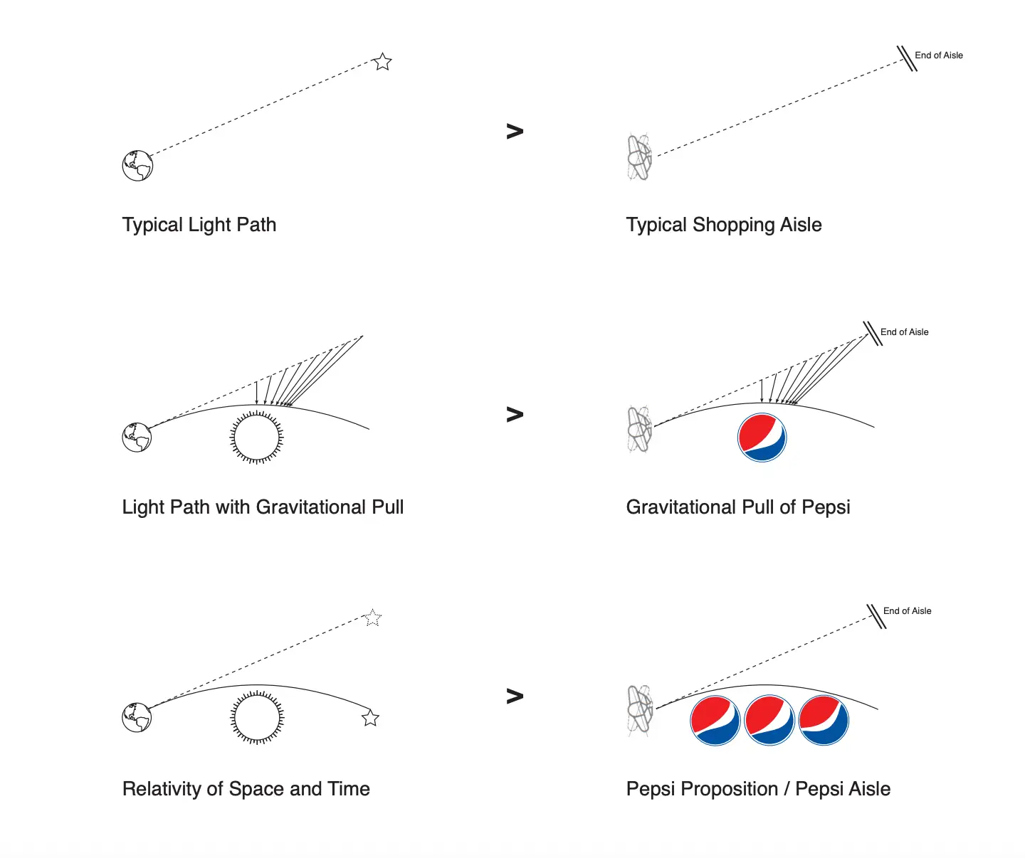
But the brand didn't stop there, they also linked the logo to the Theory of Relativity, the earth's gravitational field, and the sun's radiation as you can clearly see in this diagram.
And the colour choice isn't random either, turns out that the "The Breathtaking Color Palette is derived using a scientific method of color assignment based on the product's essence and primary features," we promise you we aren't making this up.
Advert
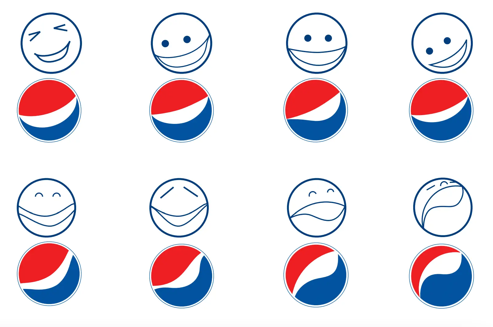
There's also something about the logo kind of looking like faces. The subheading for that section of the re-design is called 'the face of a new generation'.
To be fair, they kind of look like emojis, so maybe they were on to something...
What do you think of the Pepsi logo? Are there hidden secrets you think we missed?