What's that? Another change to Twitter - I mean X? Why am I not surprised?
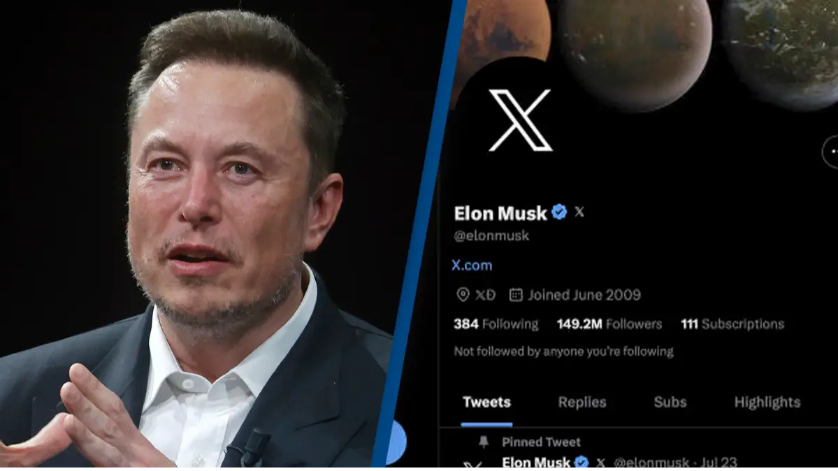
Elon Musk certainly hasn't wasted any time since he took over as owner of the social media site last year; first he brought a sink into the office, then he went for the blue ticks, and then the little bird altogether.
If you've been struggling to spot the platform among the tabs on your browser then you'll know exactly how much Musk has sought to make Twitter his own since the takeover, and he's not done yet.
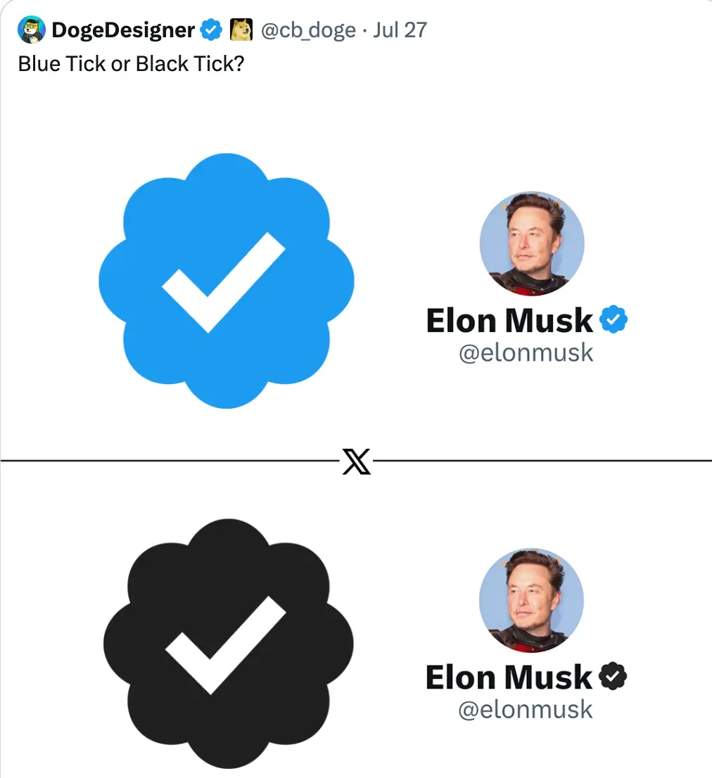
Yesterday (27 July), a graphic designer at Dogecoin took to Twitter to share a mockup of Musk's profile next to two 'verified' tick options - because of course the owner would never lose his badge.
One image showed the usual Twitter-blue tick as we know it already, while the other showed a black version, in keeping with the platform's new 'X' logo.
Alongside the image, the graphic designer wrote: "Blue Tick or Black Tick?"
The post received a lot of comments, with many people saying they were fans of the new black tick, but the graphic designer admitted that, while that was their preferred option as well, it wouldn't 'work good in the dark mode'.
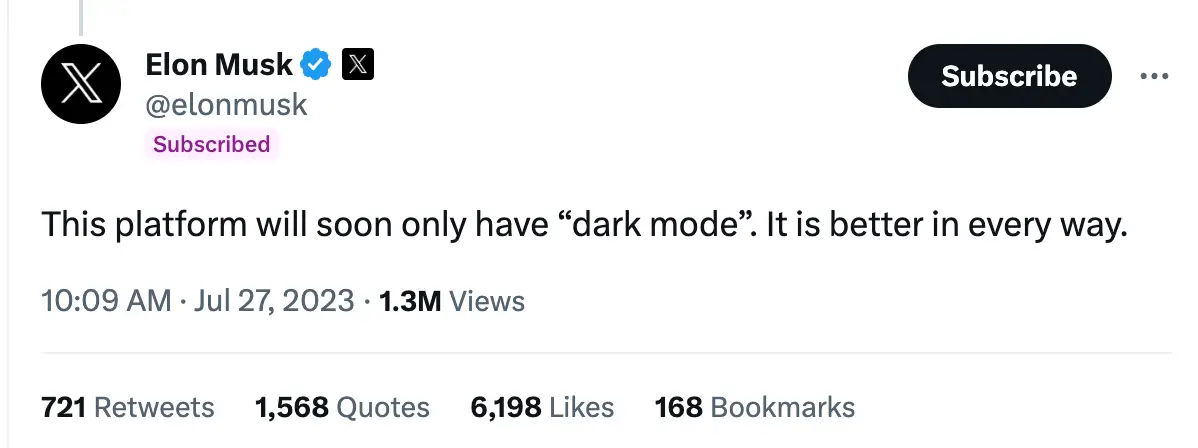
Musk came across this post during his scrolls through the platform, and explained that he had a solution for the fear that the black tick wouldn't 'look good'.
His answer? Make everything 'dark', all the time.
Musk responded: "This platform will soon only have “dark mode”. It is better in every way."
If you prefer to live on the lighter side of life, you might not be very familiar with Twitter's existing 'dark mode' option which is available to switch on through the app's settings.
It changes the usual white background of the app to black and makes all the text white, making it a bit easier on the eyes. The blue tick remains blue on the current version.
The app also currently has a 'middle ground' option known as 'dim mode', which makes the background dark blue.
If you are a fan of dark mode, then Musk's declaration about it soon being the 'only' mode might come as great news - but it's not been welcomed by everyone.
One person argued that limiting users only to dark mode will 'cause a loss in accessibility in some users', with another adding: "Not everyone’s eyes can handle dark mode."
It's unclear what has sparked Musk's decision to change the app even further - except, perhaps, simple personal preference - but it will be interesting to see how it goes down with users if Musk moves ahead.

 Emily Brown

